Select a chart on the right
BTC |
ETH |
LTC |
EOS |
ADA |
XTZ
Trend | Momentum | Volume | Volatility
Trend | Momentum | Volume | Volatility
Trend
💡 In which direction the market is moving.
- Moving Averages
- Parabolic SAR
- Ichimoku Kinko Hyo (aka. Ichimoku Cloud)
- Moving Average Convergence Divergence (MACD)
Moving averages
(» Show chart «)- 50 day MA / 100 day MA / 200 day MA
- 350 day MA * 3 / 350 day MA * 2 / 111 day MA
- 21 week MA
- 50d crosses 200d MA = golden cross = trend reverval up
- 150d crosses 600d MA = golden cross (like 50d/200d on a 3 day chart)
- 100d MA = support in a bull market
- 200d crosses 50d MA = death cross = trend reversal down
- 350 MA * 3 = potential new top
- 350 MA * 2 = slow line
- 111 MA = fast line
- 111 MA (fast line) crosses or touches 350 MA * 2 (slow line) = game over!
- 21w MA = support in a bull market / resistance in a bear market
- 128d MA = support in a bull market / resistance in a bear market
- 200w MA = best time to DCA (entry)
- GMMA (Guppy Multiple Moving Average)
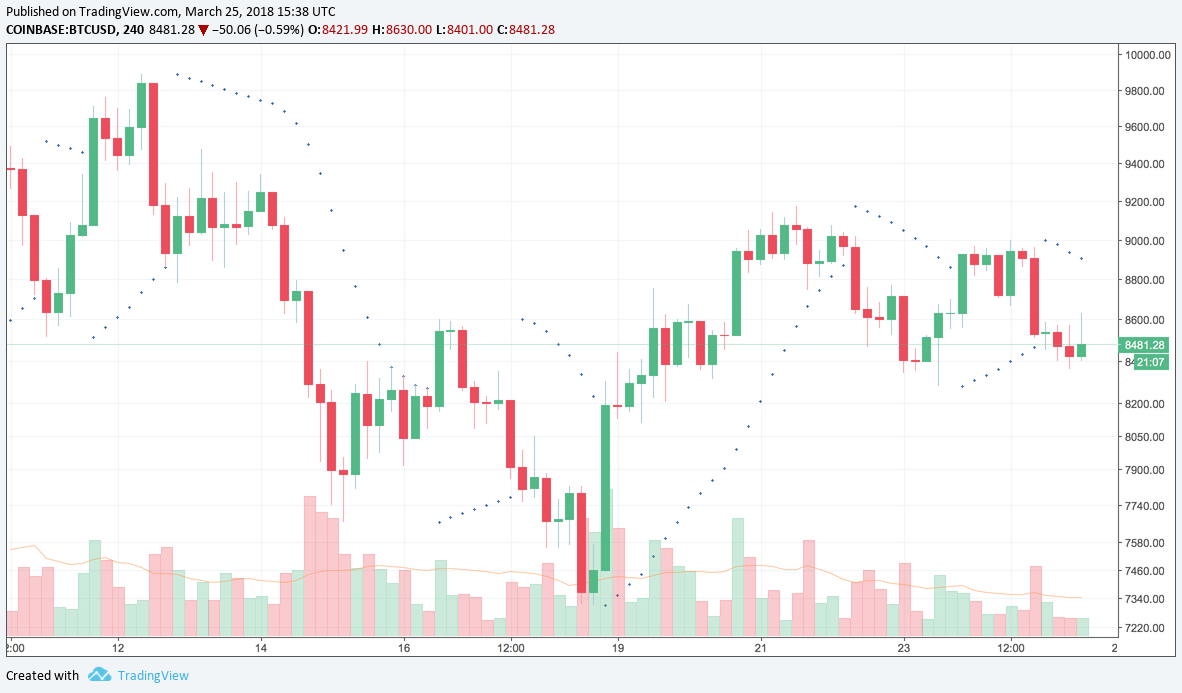
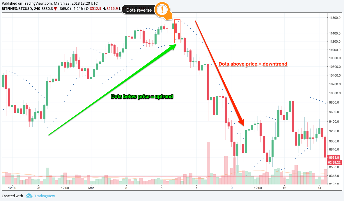
Parabolic Stop and Reverse (SAR)
(» Show chart «)» Dots are placed on the chart above or below the price.
💡 Indicate the potential direction of the price movement.
» Dots above the price = 📉 downtrend
» Dots below the price = 📈 uptrend
⚠️ Do not use Parabolic SAR in a ranging market (price is moving sideways). Lot of noise. Dots flip from side-to-side = no clear signal.
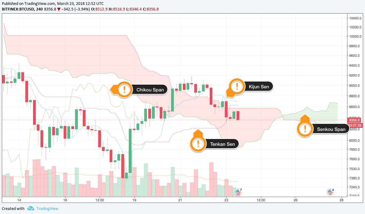
Ichimoku Kinko Hyo (aka. Ichimoku Cloud)
(» Show chart «)💡 Measures future price momentum
💡 Determines areas of future support and resistance
- Kijun Sen (blue line / Standard line or base line):
Calculated by averaging the highest high and the lowest low for the past 26 periods - Tenkan Sen (red line / The turning line):
Derived by averaging the highest high and the lowest low for the past 9 periods - Chikou Span (green line / Lagging line):
Today’s closing price plotted 26 periods behind - Senkou Span (red/green band):
1st Senkou line is calculated by averaging the Tenkan Sen and the Kijun Sen and plotted 26 periods ahead.
2nd Senkou line is calculated by averaging the highest high and the lowest low over the past 52 periods, and plotting it 26 periods ahead.
Settings:
- Legacy: 9, 26, 52, 26 (Stock market)
- 24/7 Markets: 20, 60, 120, 30 (Bitcoin)
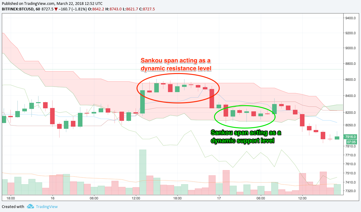
The Senkou span = dynamic support and resistance levels.
» Price above Senkou span = top line acts as first support and the bottom line as second support.
» Price below Senkou span = bottom line acts as the first resistance and the top line as the second resistance.
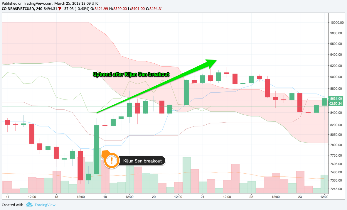
Kijun Sen (blue line) = confirm trends.
» Price breakouts above the line = likely rise further.
» Price drops below the line = likely go lower.
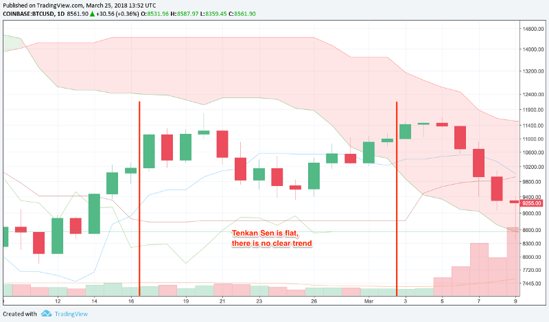
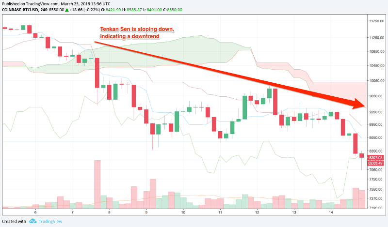
Tenkan Sen (red line) = confirm trends
» Line moving up or down = market is trending.
» Line moving sideways = market is ranging.
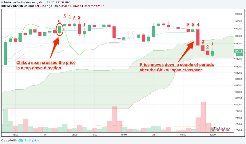
Chikou span (green line) = trend indicator. (Plotted 26 periods BEHIND the current period.)
» Line crosses the price in a bottom-up direction = the price is likely to go up.
» Line crosses the price in a top-down direction = the price is likely to go down.
⚠️ If you get your Kijun Sen (blue line) and your Chikou Span (green line) mixed up, then you could mistake a downtrend for an uptrend!
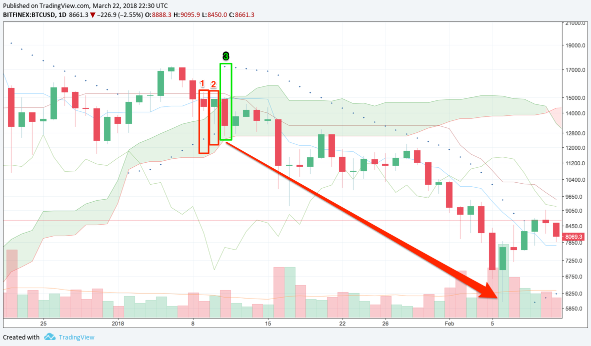
Parabolic SAR & Ichimoku Cloud
(» Show chart «)
1)
» The price closed below the Kijun Sen (blue line) = price might go lower.
2)
» Price below the Kijun Sen = bearish
» Parabolic SAR is still below the candlestick = bullish
» Conflict between the 2 indicators = do nothing
3)
» Price under the Kijun Sen = bearish
» Parabolic SAR has flipped sides (!)
» Both indicators are showing bearish signals = 📉 go short!
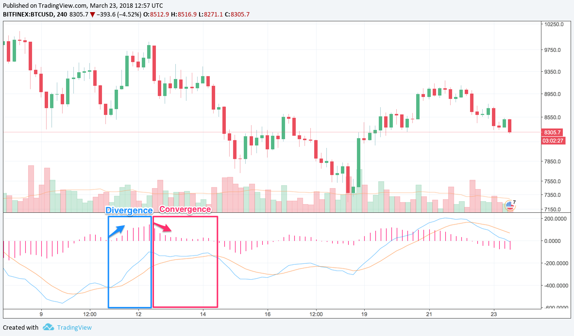
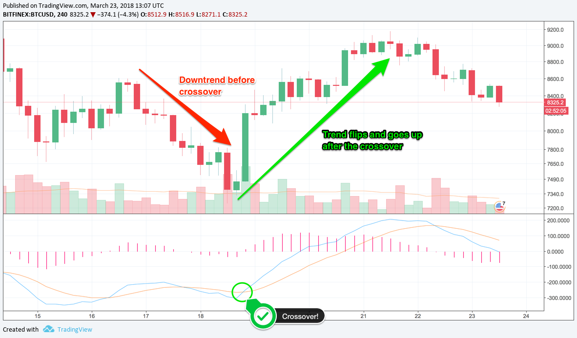
Moving Average Convergence Divergence (MACD)
(» Show chart «)» Moving averages of other moving averages
» Consists of a fast line, slow line, and a histogram
Config: MACD "12, 26, 9"
- Fast line: Moving average of the difference between the 12-period and 26-period moving averages.
- Slow line: 9-period moving average of the MACD fast line.
- Histogram: Difference between the MACD lines.
"Convergence divergence" = the lines crossover.
» As the difference between the 2 lines gets smaller, they get closer together, i.e. converge.
» When the difference gets bigger, they get further apart, i.e. diverge.
When a new trend is forming, the MACD lines will converge, eventually they’ll crossover (indicating that the trend has reversed), and the lines then start to diverge.
At the point of crossover, the histogram will disappear because the difference between the lines is 0.
📈 Fast line (blue) crossed over the slow line (orange) = indicates that the previous downtrend has ended and an uptrend is starting.
⚠️ MACD lags behind price quite a lot = not the best indicator to get into trends early. Good for confirming trends.